|
|
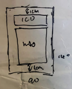
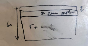
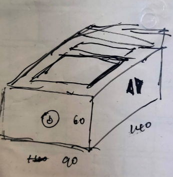
SketchThis week, I decided to focus on the design of my box and what materials I would want to use. I also thought roughly on what kind of inputs and outputs i would want in my final products. Currently, the life counter i use is in the form of an app. It serves its purpose rather well, but looks rather boring as it only has the life on it. In addition, there isn't a place to showcase my general when I'm playing. Now, given this oppoturnity, I wanted to make a flashy counter that not only will turn heads duing gameplay, but also allow me to promiently display my general on it with a dedicated slot. To get the sizing right for the shell, i first took some measurements of a single MTG card (64x88mm), the lcd panel and added some padding along all the sides so as to ensure all elements would fit in the box. this came to a box of 140x90x60mm. These are the sketches i made to help me conceptualise the box. 


You might notice that it looks slightly different than the one linked here. After some drawing, i realised having it display from a top down angle is better as people from all sides will be able to see your life clearer, hence the change in design. Next up, the Box |